Meditavie
What is Vie del Benaco?
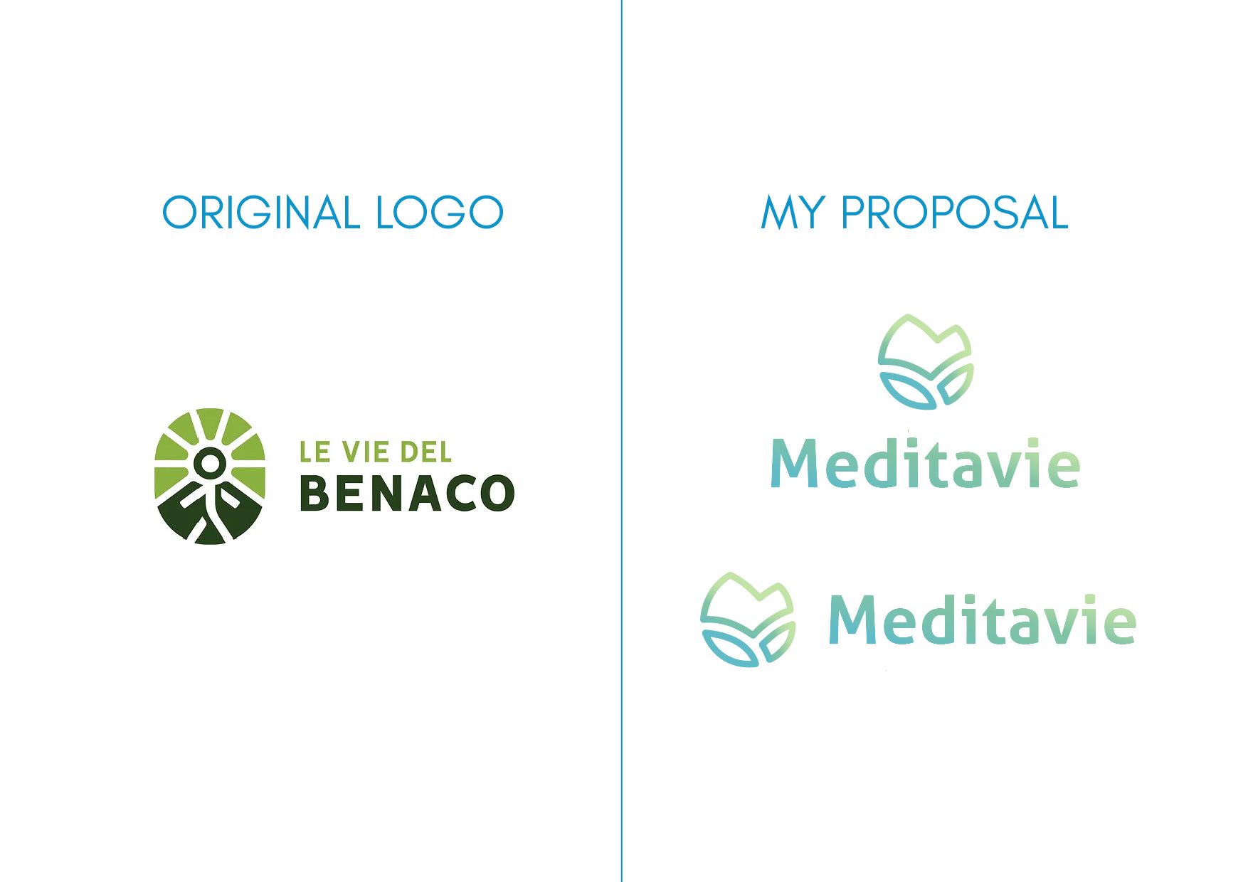
Le vie del Benaco is a non-profit association of cultural, environmental and social utility, located in Toscolano Maderno town, near Garda Lake. The organization offers three hiking-religious routes, of varying difficulty, with the aim of discovering as many places as possible in the municipality. The project stems from the common passion of the journey and the spiritual vision of it to enhance the territory through union and sustainability.
Rebranding: Concept
The rebranding main goal was to communicate how the project does not want to be just a religious pilgrimage, but also a cultural discovery. The association wanted to extend his target not only to those who wanted to embark on a spiritual journey, but also to tourists interested in discovering the artistic riches of the area, to sportsmen or families who wanted to do an activity together. In addition, it was necessary to convey respect for nature, promoting eco-sustainable tourism.
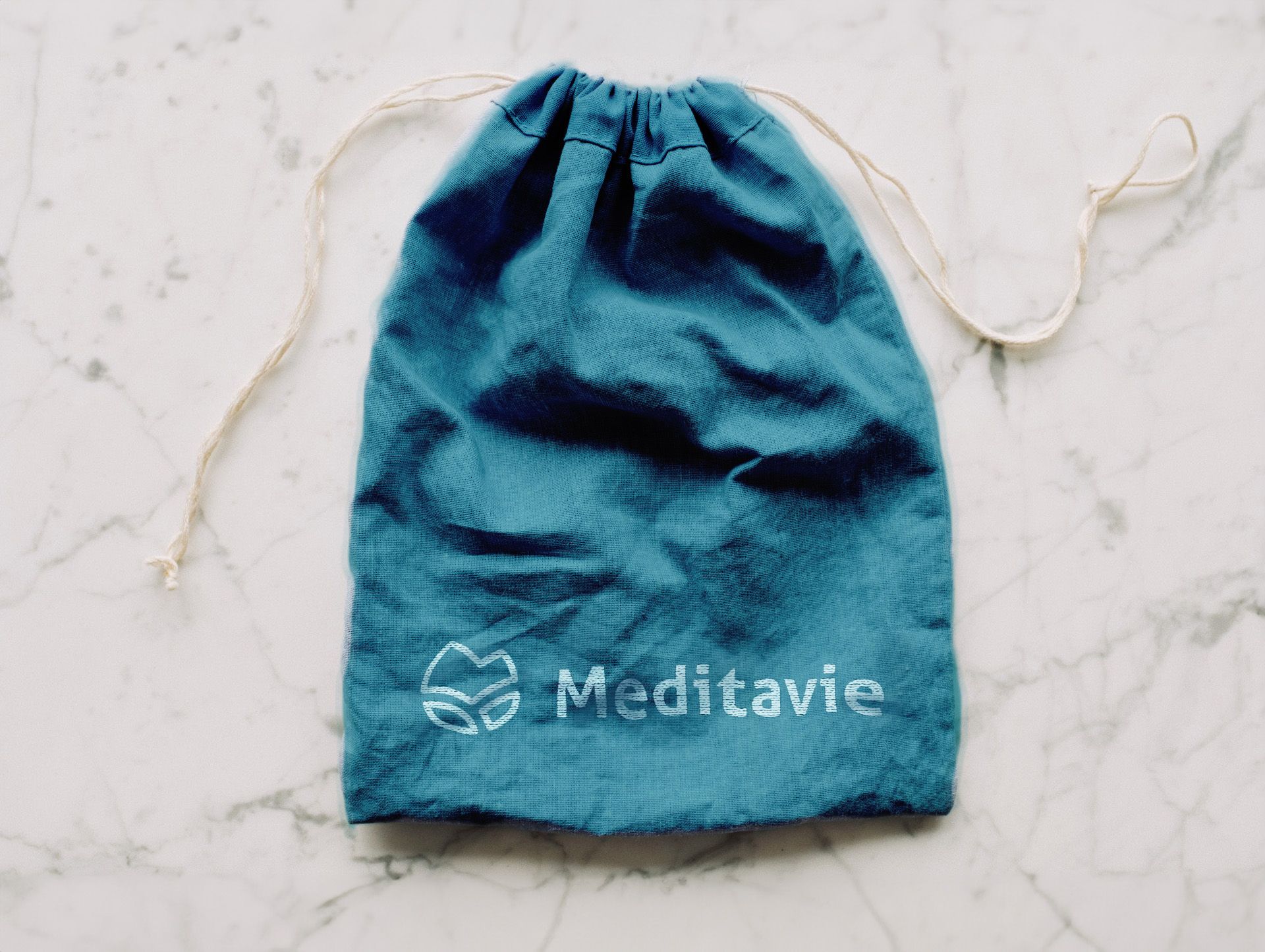
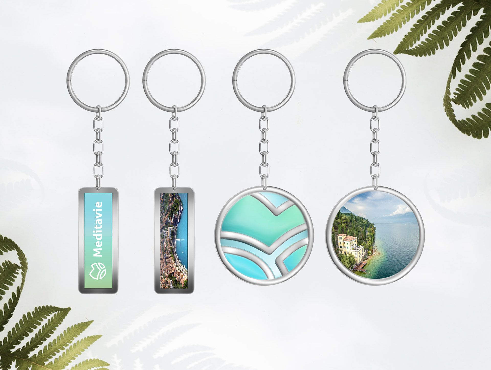
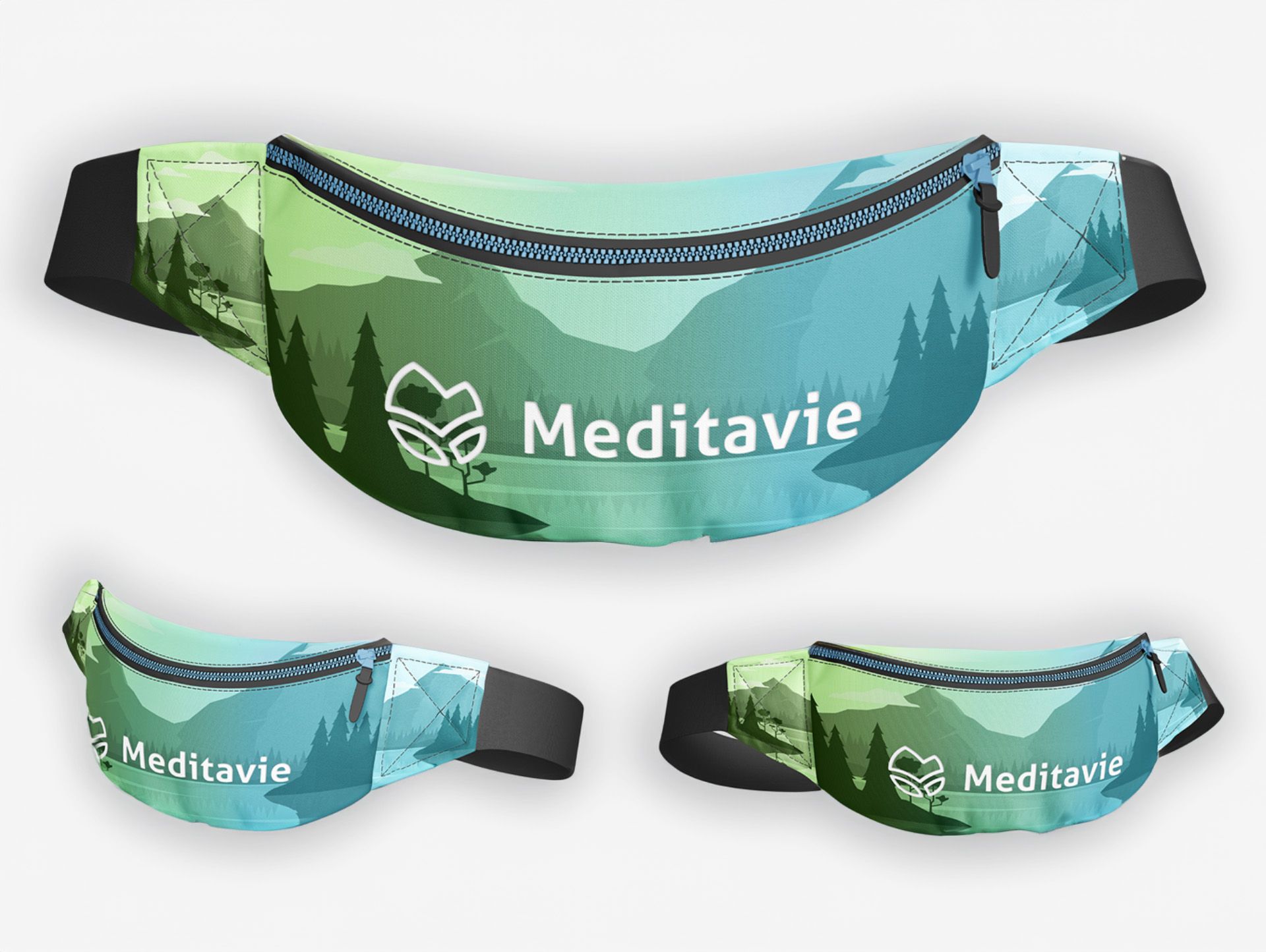
My proposal includes naming, logo, paperwork, gadgets and route signage.
Redesigning the logo
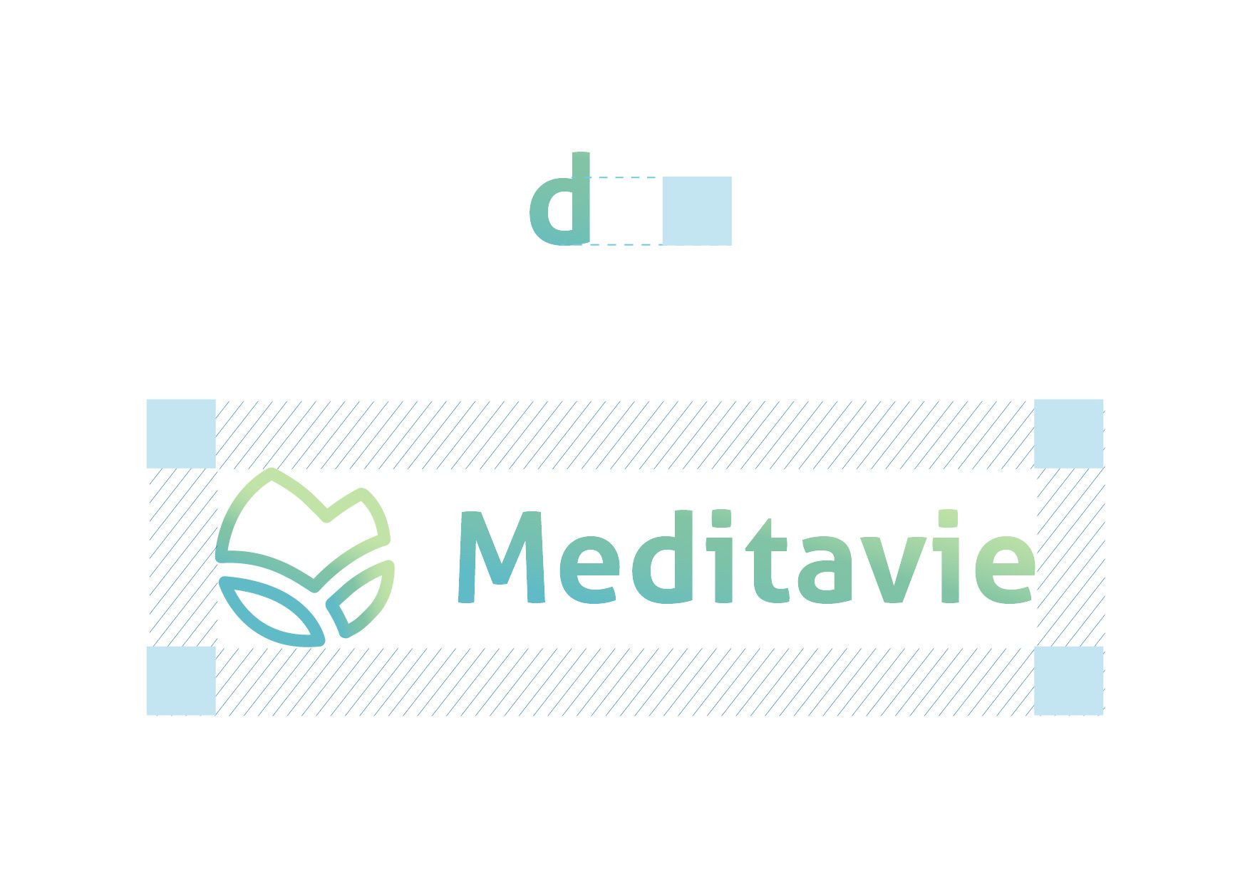
The naming emphasizes the spiritual and relaxing aspect of the paths. It’s detached from a concept of a place because it proposes itself with the transversal spirit of being an “experience”: it’s the very experience of the journey, of the calm and introspection that it brings, the reason to push the target to undertake these routes. Furthermore, it’s also easy to memorize since it’s shorter than the previous naming and based on a wordplay: Meditavie, translated in italian, sounds like a combination between the words meditation (meditazione) and paths (vie).
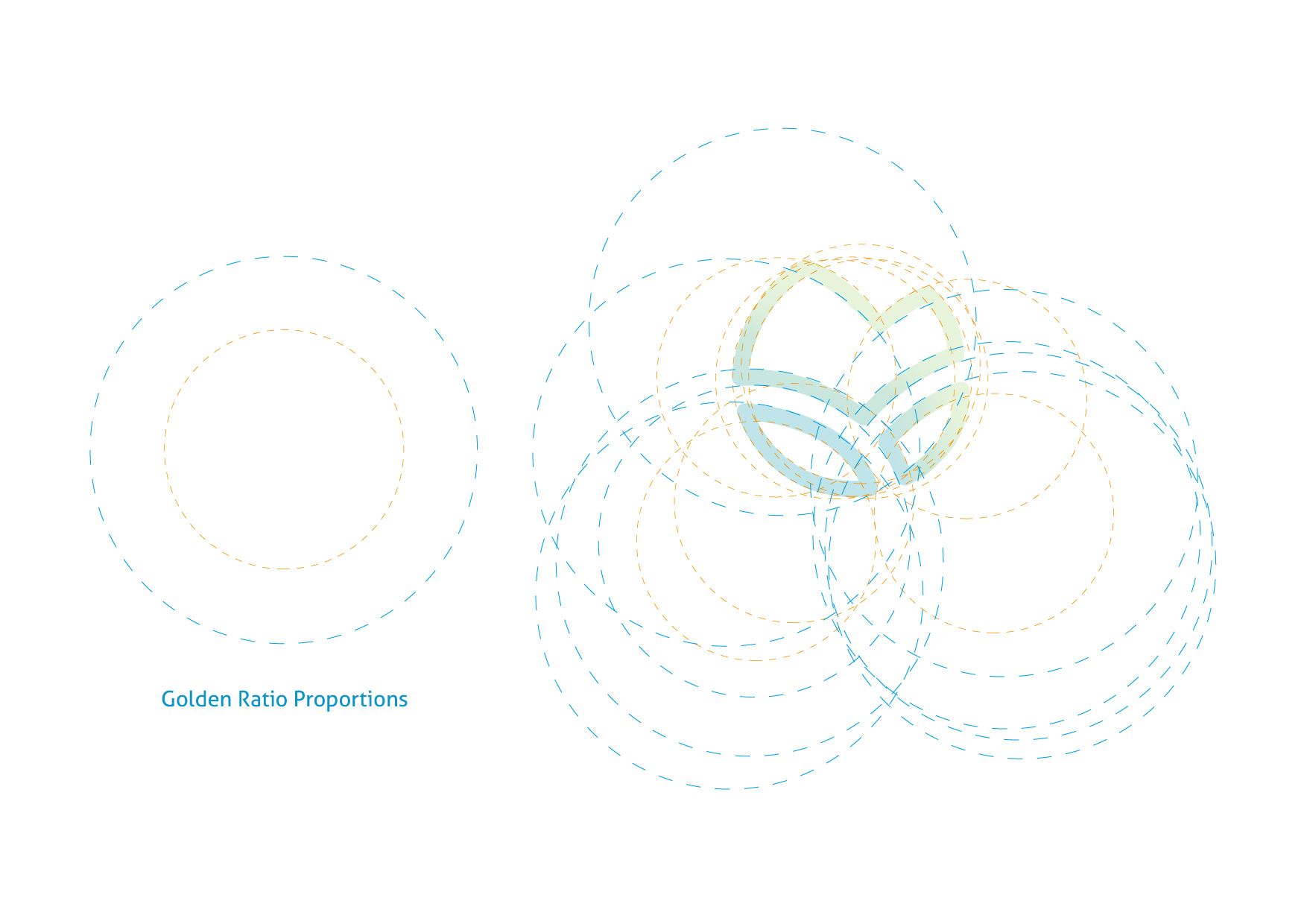
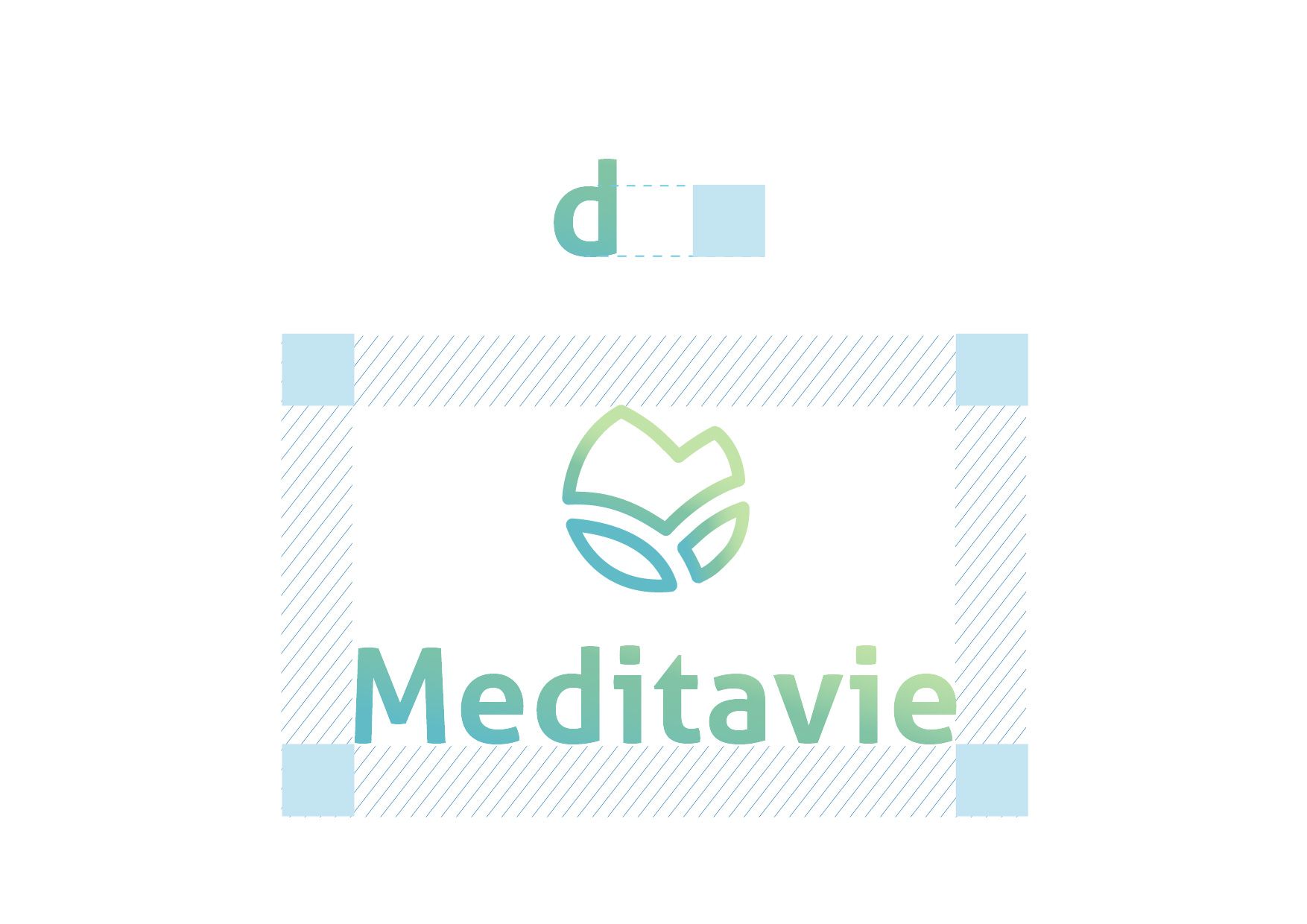
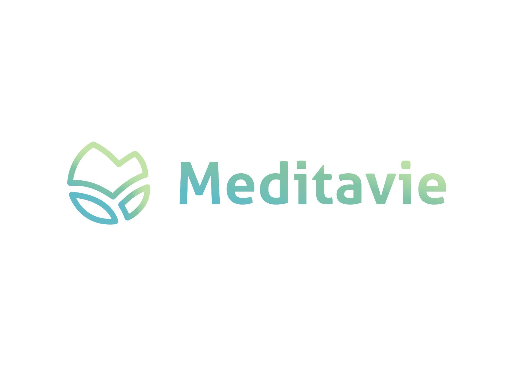
The pictogram is made of three lines representing the three paths that branch off on the territory, each one forming a figure. The figure in the lower left represents the lake, the figure in the lower right the hills, the third at the top the mountains. At the center, in negative between the shapes, we can see a semi-cross, to represent the spiritual purpose of the project.
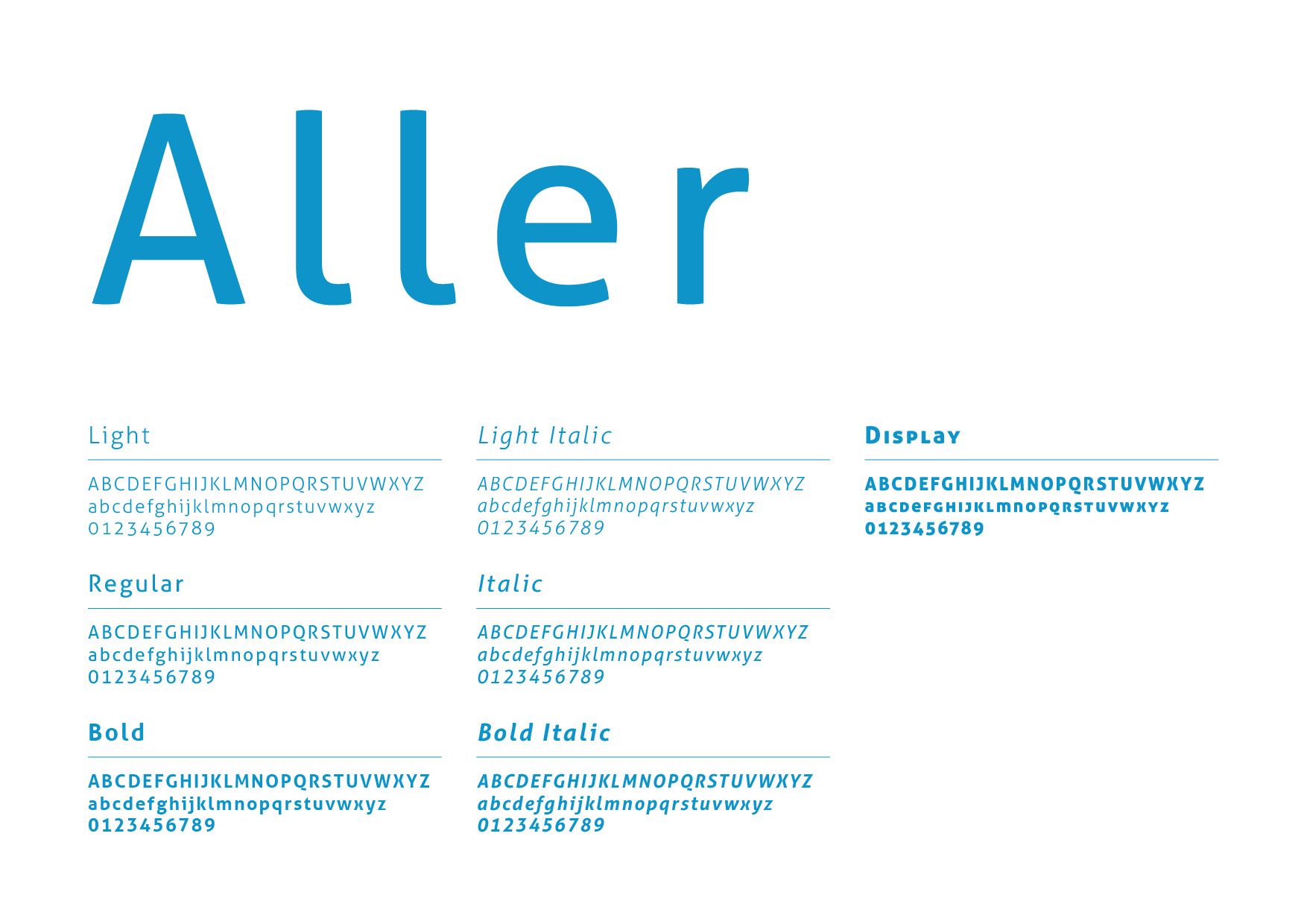
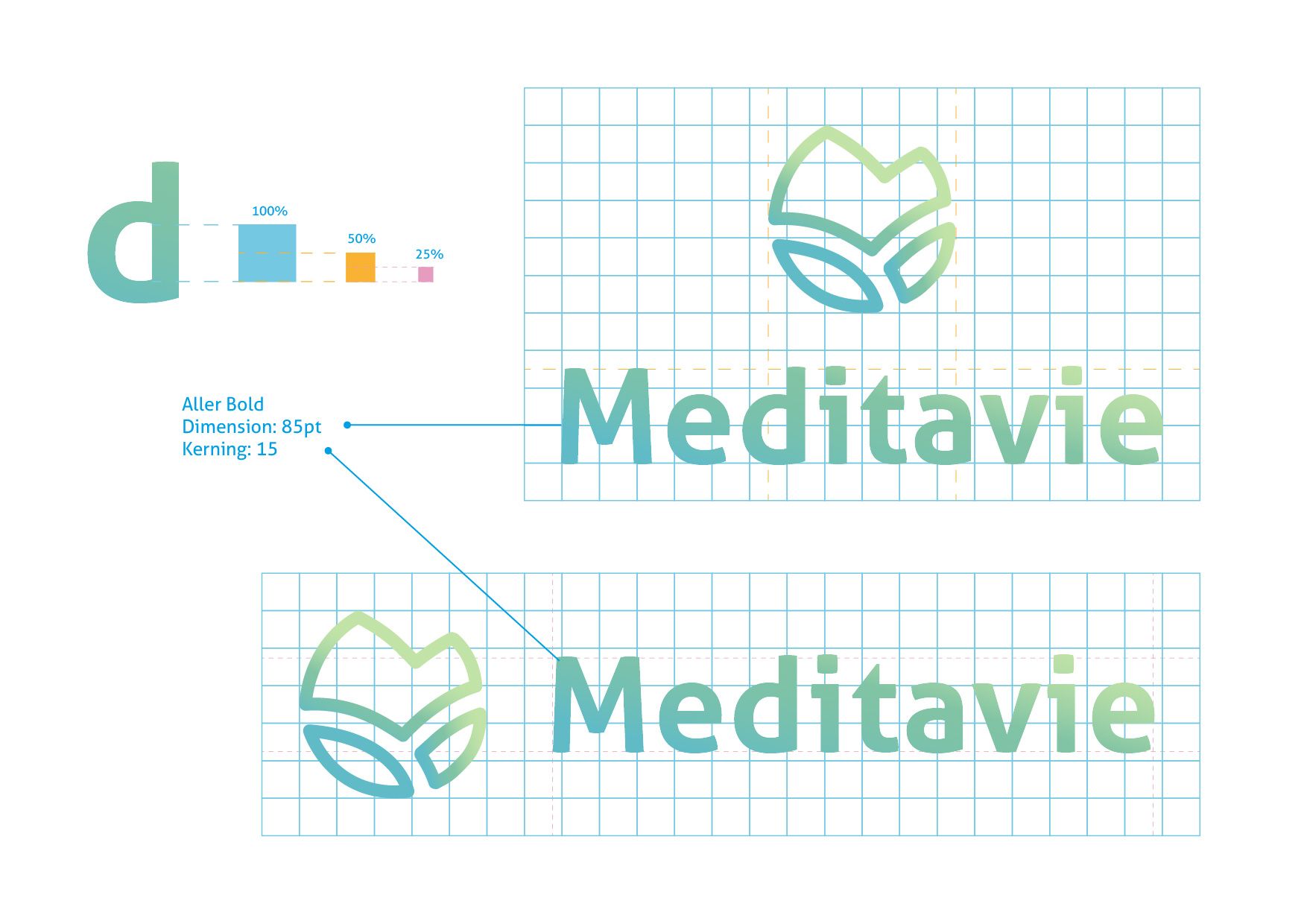
The font chosen for the logotype is Aller Bold, a sans serif font that, in its slender and soft shapes, recalls the pictogram. Its family, composed of seven different styles, can be extremely versatile, as it is easily readable both in small and large sizes. This characteristic can lead to its use in future titles, prints on gadgets or signage supports. Another important feature is that it is free-commercial use and therefore usable without copyright problems in case of use at sale.
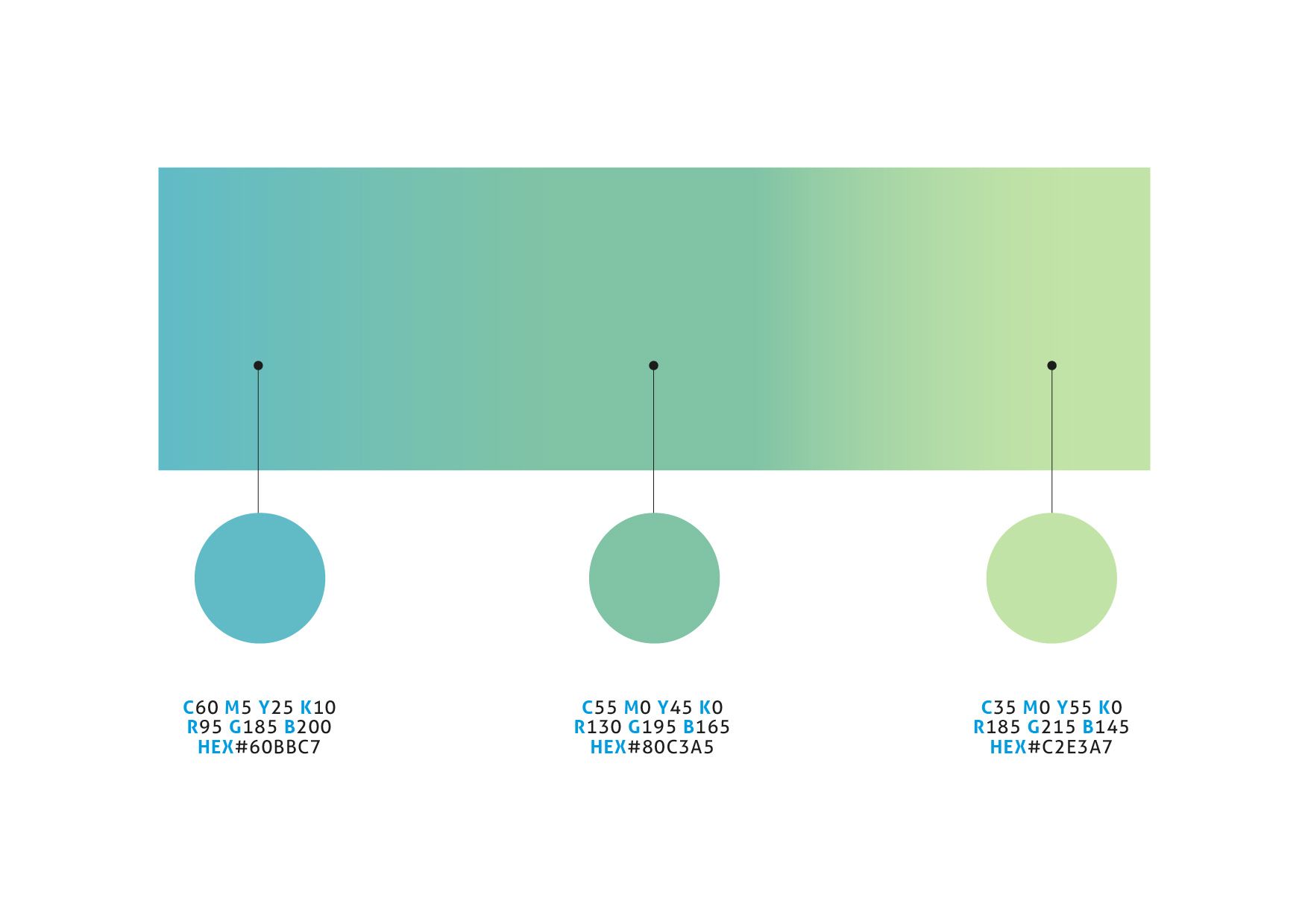
The color palette used for the pictogram and the logotype emphasize the sense of harmony, nature, stillness and spirituality that the brand wants to transmit. The color green represents stability and perseverance, while blue symbolizes transcendence and tranquility. The two shades of green chosen are also reminiscent of the meadow and forest of the municipality’s landscape, while the cerulean is the color of the nearby lake.
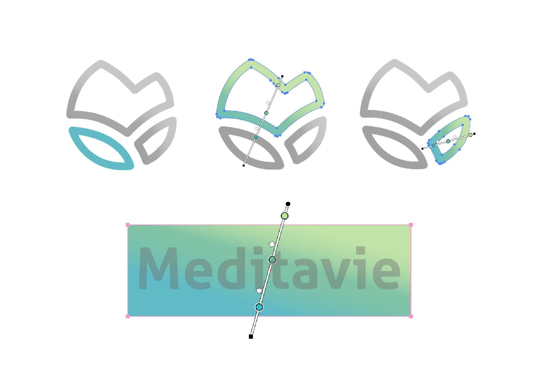
From the three shades of the pictogram’s gradient can be drawn three variations of the logo itself. These variants can be used in the future for the purpose of differentiating between routes (using each for a different route) or depending on the medium (one for signage, one for the web and one for the production of printed material).



Signage

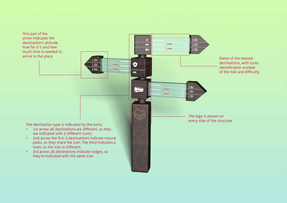
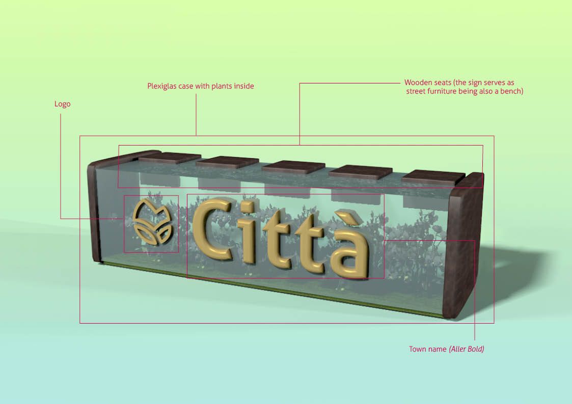
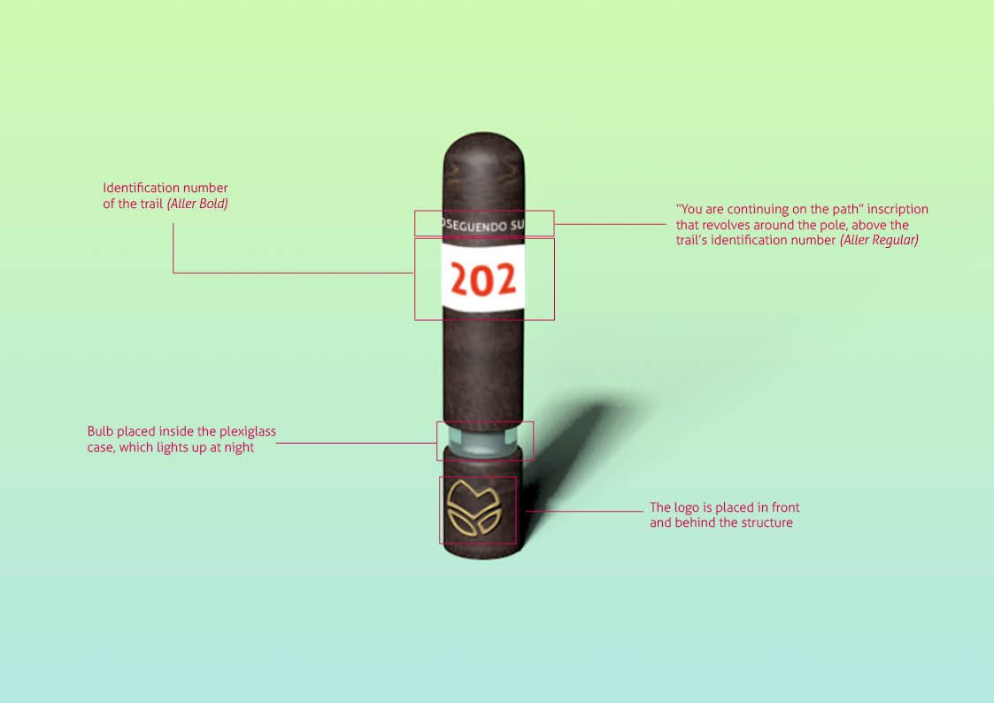
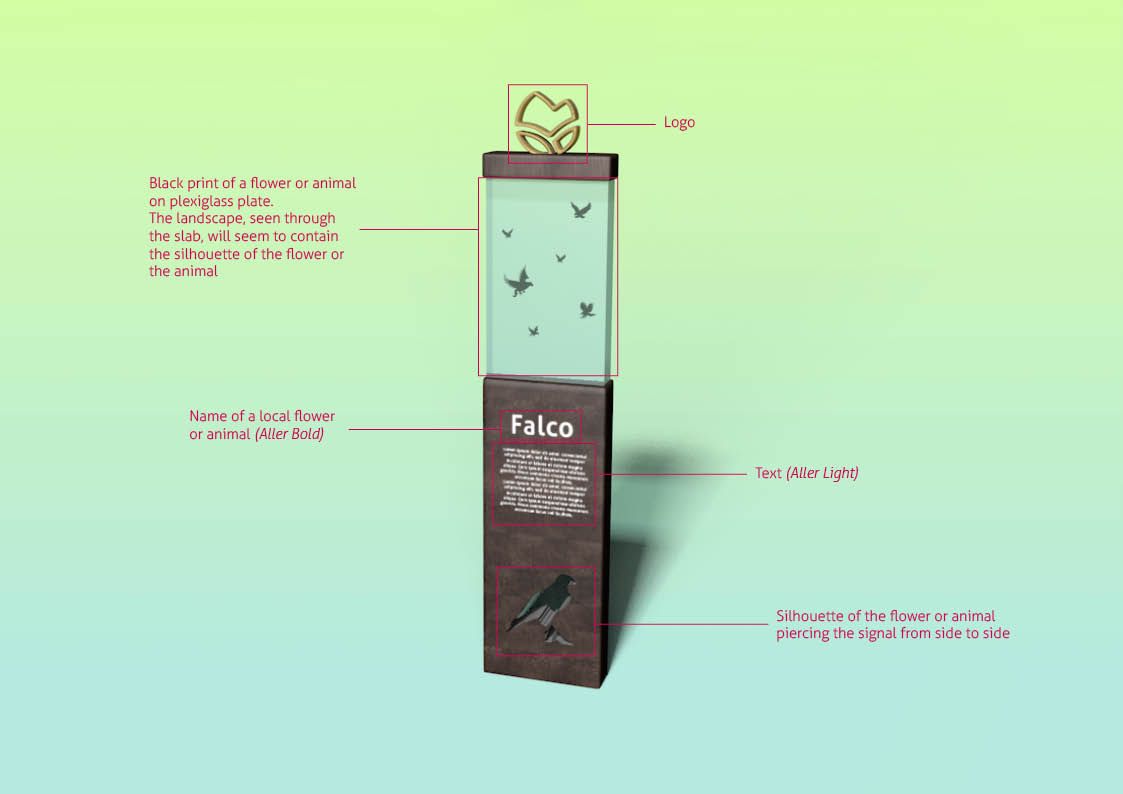
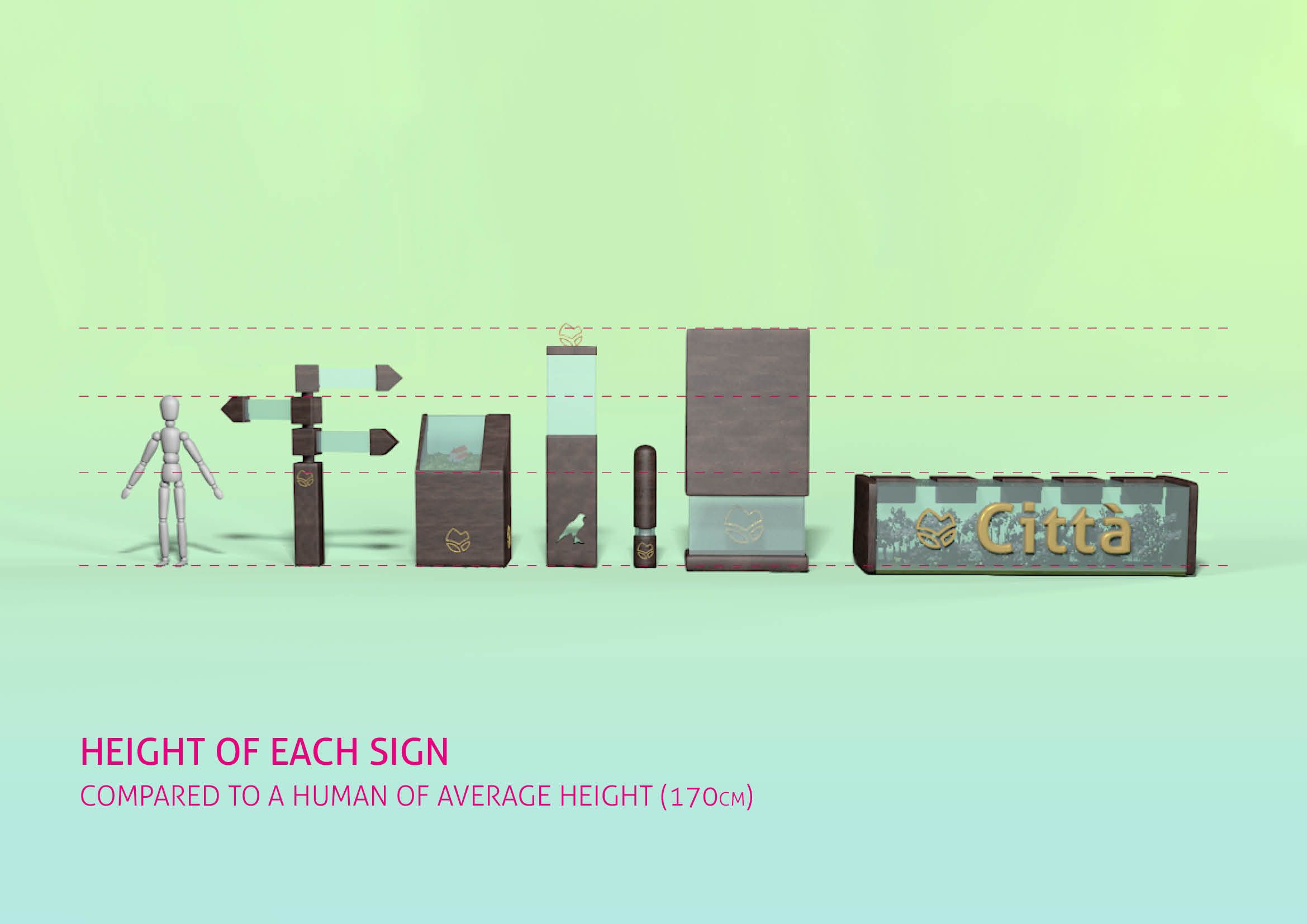
The shapes of the signage are different but they all share the same compact design to improve weather resilience. The appearance is improved by pairing the organic dark wood with the see through plexiglass. The wood blends seamlessly with the surrounding nature while the plexiglass lightens the structure with an inviting and approchable look. The logo, made in metal, is always part of the design and shines trough a galvanized gilding.

- +39 3491344090
-
This email address is being protected from spambots. You need JavaScript enabled to view it.
